
Similarities leading up to the stock market crash of 1929 and to today can be found in the charts below. Fundamentally there were some similarities too, money was moving from Europe to the US but I'm just concerned with the technical analysis, go to Martin Armstrong's website and learn more. I'm comparing 2 charts and what could be possibly a sling shot move as mentioned by Martin Armstrong. Watch the video

Everybody thinks that it was the stock market that caused the crash in 1929, the stock market was just a byproduct of the debt market, . The flight of money leaving the bond market caused the run up in US stocks causing the great depression, then there was no more money left
Armstrong is the authority on timing, but I have some interesting charts worth looking at and thinking about.

If the Dow Jones Industrial Average does the same as 1927 to 1929... using Fibonacci analysis and being constant today vs. the 1920's... we're looking close to 50,000 on the Dow.
- 1 on the scale is taken from the low in 1918 to the high in 1920 and then put it over the break out point in 1926... wallah... the high in 1929... Cool Ha.
- I did the same with the low in 2002 to the high in 2007 and then put the Fibo scale over the break out point somewhere around the present day / past year... wallah...
- To extend the projected rally into the next 7 years... I used the Andrews pitchfork. I did the same for the 1926 bounce off of support... Cool Ha.

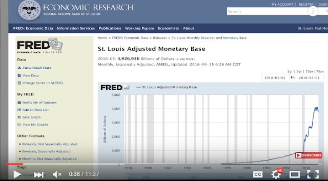
Mike Maloney explains the St. Louis Adjusted Monetary Base - and stuff.
The charts below show my interpretation of the expansion of monetary policy from 1918 to the present day. I'm using some Elliott Wave Analysis, so it can be interpreted differently, perhaps Robert Prechter would have same wave count, perhaps not. The end result is either the FED stops printing to prop the market or continues. As Jim Rogers would say "they'll do the only thing they know how to do, PRINT MONEY". The only question is... is it sooner rather than later?
Hard to say how this will end up, but if the past is any indication, the money printing - QE - will continue until something blows up.
 |
| Courtesy St. Louis Fed - click on chart to go to their website - I added the analysis |
 |
| Courtesy St. Louis Fed - click on chart to go to their website - I added the analysis |

Does the S&P 500 go to 1600... support that used to be resistance similar to mid 1926... then a rocket launch to the moon.
 |
| Courtesy St. Louis Fed - click on chart to go to their website - I added the analysis |
 |
| Courtesy St. Louis Fed - click on chart to go to their website - I added the analysis
This chart below was taken on April 21, 2016. Looks like this wave is ending from February, 2016... the only question is now... do we go down to 1600 on the S&P 500 and then have a sling shot move up big time or continue a downward spiral into the abyss. The chart above shows you how the FED didn't print massive amounts of money from 1925 to 1929 and then actually deflated the monetary base. Note how the monetary base broke out of resistance in the horizontal channel, correlates with the low seen in the Dow Jones Industrial Average mid 1932...
|

There's more to write about what's going on in the charts above , but that's all I'm going to say.
No comments:
Post a Comment