
Two charts I'm looking at this week, the S & P 500 compared to the TLT I Shares 20+ Year Treasury Bond ETF, not much to say about it, the charts explain themselves.
Money flows to where it gets it's best return. One thing that comes to mind is the Ray Dalio - All Weather Fund -
There are only four things that move the prices of assets:
1. Inflation
2. Deflation
3. Rising economic growth
4. Declining economic growth
There are 4 different environments that'll make asset prices go up or down:
1. Higher than expected inflation (rising prices),
2. Lower than expected inflation (or deflation),
3. Higher than expected economic growth, and
4. Lower than expected economic growth.
- 30% in STOCKS
- Long-term GOVERNMENT BONDS. 15% in intermediate term (7- to 10-year Treasuries) and 40% in long-term bonds [20- to 25-year Treasuries]. Bonds counter the volatility of the stocks.
- 7.5% in GOLD and 7.5% in COMMODITIES. This will do well with accelerated inflation so you would want a percentage in gold and commodities
- Equals 100%
Knowing that there's capital flowing from one asset class to another, how does that translate to the charts below? Well, know that bond yield is the lowest in all of history money wants return on investment. Money leaves the bond market and into STOCKS, also, we have to keep in mind precious metals and commodities. Judging by the charts below and the patterns in place, it's highly probable we see the equities fall into August while bond prices increase into August. If this scenario happens we could possibly see a mass and swift exodus out of bonds and into equities.
So how do precious metals and commodities play into this? good question, could possibly go up in tandem with equities or equities could actually fall and a massive amount of money goes into precious metal and commodities.
The charts below seem to play into Martin Armstrong's timing model as well. "The Fed has really lost control of the economy, but the mainstream still needs to figure this out. Our model goes nuts from 2018 into 2020".
The Ray Dalio all weather fund is about weathering out any financial storm. The very instant I saw the components of the fund I noticed the ingenious in it's simplicity, money just goes from one asset class to another, the big question is WHERE!
- We know the bond market is in a bubble "capital flows out", that's a given.
- Investors are losing confidence in the government. Money into precious metals?
- Is it all into equities OR both?


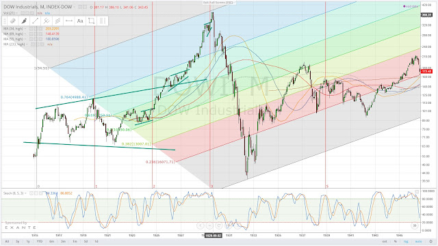
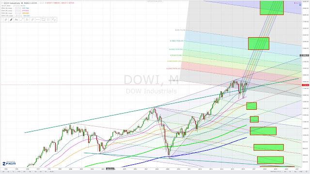
Note below - the pattern similarities between the 1920's and today with the Dow Jones Industrial Average


No comments:
Post a Comment